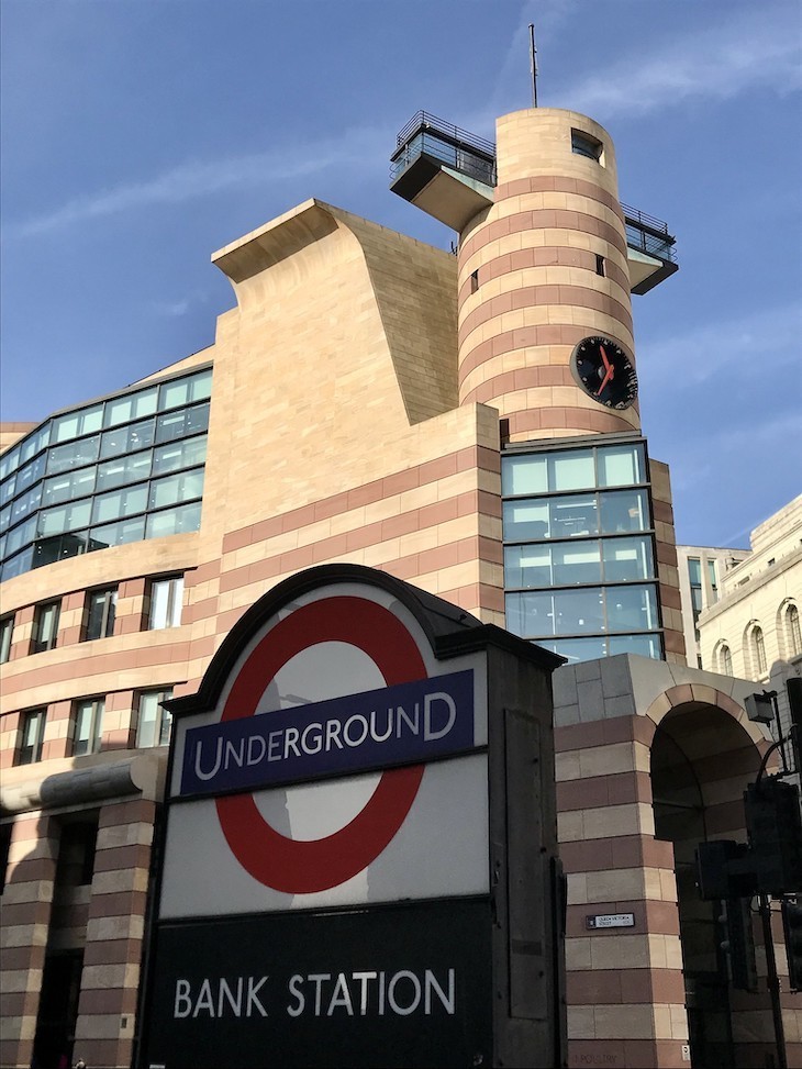
Many people hate this James Sterling creation on Bank junction. It has been called unsubtle, childish and crass. Some lament the elegant Mappin & Webb building it replaced in the 1990s. But I have to admit to being rather fond on No 1 Poultry. The striking use of colour really stands out in an area dominated by white Edwardian stonework (and that’s just the outside; the inner court would look gaudy even to Mr Tumble). It is defiantly unsympathetic to its neighbours. And why not? There is excitement and even beauty in contrast. Plus, it does look a little bit like Bagpuss. In 2016 it became one of the first postmodern buildings to gain protected status, when Historic England awarded it a Grade II* listing.
【単語】
Poultry 家禽の肉、鶏肉
roundel 小円盤、円形パネル、丸窓、飾りメダル
unsubtle 機微の欠乏
crass 愚鈍な、はなはだしい、ひどい
lament 嘆き悲しむ、哀悼する、悔やむ
fond (…を)好んで、優しい、情け深い、愛におぼれた、甘い
dominate (…を)支配する、圧する、威圧する、(…に)優位を占める、(…で)首位になる
gaudy (下品なほど)けばけばしい、派手で俗っぽい
defiantly 恐れ気もなく、〈平気、大胆〉・恐れ気もなく、反抗的に
unsympathetic 同情のない、冷淡な、共感しないで
【訳】※赤はdeepl訳
3. No 1 Poultry, City of London The pink and cream stripy postmodern facade of number One Poultry with a Bank roundel in front
ピンクとクリームのストライプのポストモダンなファサードを持つNo.1 Poultryと正面の銀行の丸印 Many people hate this James Sterling creation on Bank junction.
多くの人がこのバンクのジャンクションにあるジェームズ・ステアリングの作品を好いていません
多くの人が、Bank junctionにあるこのJames Sterlingの作品を嫌っています。
It has been called unsubtle, childish and crass.
それは機微が欠乏していて、子供っぽくて、愚鈍な感じと言われています。
繊細さに欠ける、子供っぽい、粗野だと言われています。
Some lament the elegant Mappin & Webb building it replaced in the 1990s.
いくつかのビルは1990年代に建て替えられました
1990年代に建てられたMappin & Webb社のエレガントな建物を惜しむ声もあります。
But I have to admit to being rather fond on No 1 Poultry.
しかし私は認めなくてはならない、NO.1のPoultryがかなり好ましいということを
しかし、私はNo.1 Poultryのことがかなり好きです。
The striking use of colour really stands out in an area dominated by white Edwardian stonework (and that’s just the outside; the inner court would look gaudy even to Mr Tumble).
_-_geograph.org.uk_-_1229496.jpg)